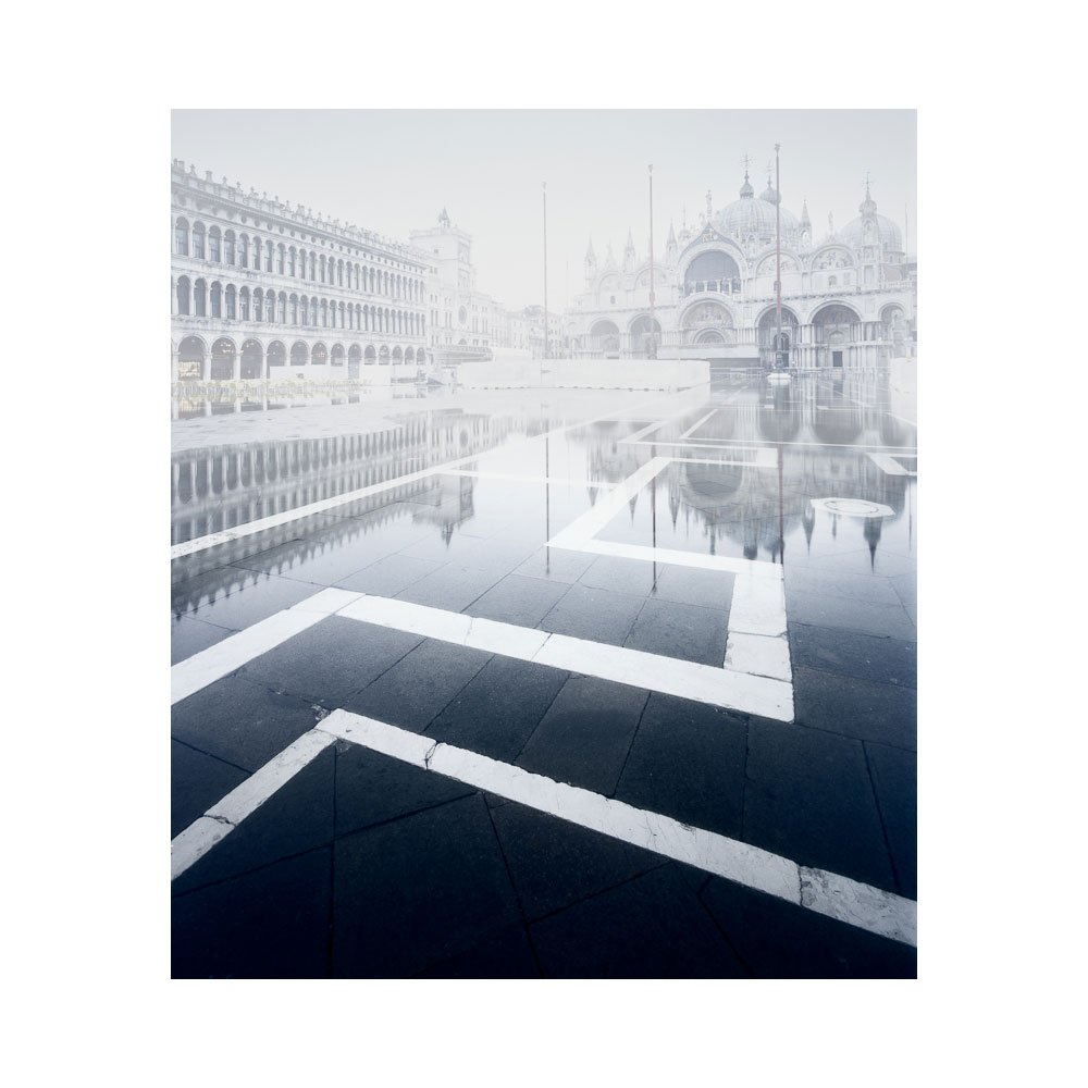
The White City

It is my view, that the majority of the world has not been photographed (there is still much to do), and for those few places that have been photographed, they have, for the most part, not been photographed to their full potential.

So when someone tells me ‘Iceland has been done’, or ‘Yosemite has been done’, or even for that matter ‘Venice has been done’, I think they are missing the point.

These places may have been photographed a lot, but have they been photographed to their full potential? I think not. Do we see individuality in the majority of the photos of these known places? I do not think so.

I write this with the positive view that there is always a new take on some place, and to assume that all the best places in the world have now been photographed simply isn’t true (consider that most photographs happen within 200 feet of a car, then you can appreciate that we’ve only really scratched the surface).

And that is where I think we are at now. Perhaps doing something ‘new’ in a tried and tested place is to set the bar too high (it would be quite an achievement to show a view that others have not seen).

But this should not deter us from at least attempting to produce the best work we can. Because if we try to be as good as we can be, we may hopefully be able to impart a sense of our own identity upon the work we produce.

Even if it’s just a tiny bit.

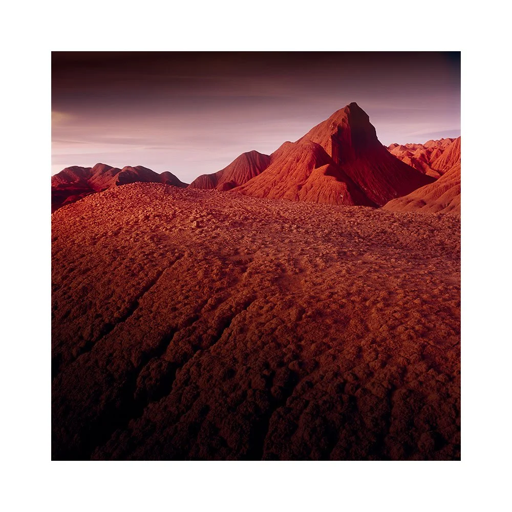
Puna de Atacama

Just to let you know that if you’ve been thinking of coming to the Puna de Atacama with me this March, that bookings will close on the 5th of January.

We need to finalise the rooms for the tour after this point.

So if you’re thinking of coming, either drop me a line to discuss, or book before 5th of January.

Share

I scrapped everything.....

For the very first time, I am scrapping a whole pile of new work when I am at an advanced stage of the edits.

Perhaps a bit of the winter blues has kicked in as my mood is not so good right now. I have noticed that when I am tired, my edits go downhill dramatically and I cannot ‘see’ what to do, or where to go with the work. The results tend to become unfocussed and poor when I am like this. Often it is sleep and some rest is always the cure.

I have decided to write this post today, with really two aims in mind: one is to draw a line under what I’m currently doing and shelve it. The other is really to illustrate that we all suffer from indecision, lack of inspiration at times, and lack of focus. Despite my mood telling me the work has no value, my heart tells me that this is really a case of taking a step back, resting, and doing something else for a while. The images will still be there, ready to go, when I do feel my mojo has returned.

So I think I will show you all my Harris images from last year.

Iceland Erruption

I find this guy the best, regarding the recent volcanic eruption in Iceland.

Share

Beyond known boundaries

I learned a lot by shooting and editing this image.

Shot on a very bright blue sky day, I only made it because my tour group wanted to do it. When I came home I found that I could push this outside of the 'sunny blue sky day' in the edit.

I realised that one of the skills I must learn is to be able to 'see' what's possible in the edit, whilst looking at the literal. And the only way to do that is to gain experience in editing, and to push your edits as far as you can, to find out where the boundaries are.

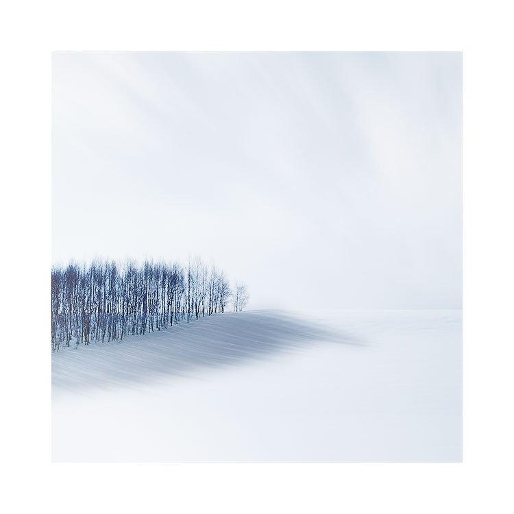
Forest Shadow, Hokkaido, 2018

For instance: I would ordinarily skip a sunny blue sky afternoon, and write it off as a no-go for me. I now know that I can work with this kind of light, and push beyond it sometimes within the edit to convey something else entirely.

Having that kind of knowledge to my disposal is vital. Knowing how much latitude you have to work with allows you to choose your source material better.

So this was one major learning event for me. I now know I can shoot in blue-sky sunny days and sometimes get something useful out of the edit session. Even though the original shot may show very little potential…..

On a different note, I’d also like to say that I have also learned that when I think I am finished with an image, sometimes I realise later on that I was only half-way there:

I think the main ‘feature’ of this image is the gradual tonal shift in the shadow - brighter towards the edge, and darker towards the centre. This helps pull the eye back into the middle of the frame and away from the edge of the forest. This was the final thing that I applied to the edit : it was not immediately apparent when I had first thought I had finished work on the photo, and only came to me after living with the image for a week or so.

Share

On being real

I just came across ‘the soft white underbelly’ YouTube channel. Interviews are absolutely fantastic such as this one with Richard whom is a DMT user with a criminal past. I found the questioning, the subject matter, how it was filmed, and also the portrait of Richard that Mark made mid-interview really special.

I have now subscribed. I like hearing real people’s real stories. We get so little of that now on TV. I have sometimes ventured back to some old Dick Cavett shows to listen to Dick interview Orson Wells (highly recommended) and George Harrison. They are real interviews, not infomercials.

I’m done with contrived content. I much prefer hearing real stories from real people.

Share

Looking for cohesion

I thought it might be nice to do a little review of the new Hokkaido images I posted in my newsletter and that now adorn this website. Specifically with the the aim of discussing how to make a set of images that are so varied (well for me at least) gel together.

I think that individual images are fine, but that they are often more interesting when they belong as part of a set. I think sets of images are in effect mini-stories. They tell us a story about the location and give us a little more of a 3D view of the place, but they also tell us a bit more about the photographer and their style of work.

I think creating sets of images is not easy for most and I think that few photographers ever sit down to collate their work into sets or group their images into themes. This is a great mistake, as we can all learn something about our photography in the process, but also about the actual work itself. When collating or grouping images together I often find relationships where I had not noticed them during the capture. For instance, with this set of images I had not envisioned the dark set of nine images that are the final portfolio that is in my gallery section at the time of capture.

In fact, when it came to editing the work, it took me a while to get started. Or perhaps more accurately, to find the right groove to work in. I had experimented with a few of the images that really stood out to me to see how they felt after I had done some interpretation / digital darkroom work on them. I think it took me around three days before I realised there was a dark theme to the set, and to the 10 days I had been in Hokkaido. Once I realised using black as a background to give the images space, then I was on my way with moving towards the final selection you see here.

There are potential problems in creating groups of images, or looking to get such tight cohesion in one’s work. And that is when you try to make images fit together that simply aren’t meant to be part of the pack. The nine images above had a natural flow to how they wanted to be edited: I often think that images tell you what they want to be, and you just have to listen to them. They tell you in the core nature of what they are.

It can be a little restrictive if you try to force all the work you’ve created to look too similar. I often think in my own case that this is a thorn in my own creativity, as I sometimes fall foul to feeling that images have to conform too tightly that I sometimes worry that I will kill the essence of what they are in an attempt to make them belong to a set.

As a response and solution to this problem, I tend to sit on the images for days because I have learned that I am not always in tune with the spirit of an image immediately. If I’ve made a bad choice, it tends to become obvious over a few days or perhaps a few weeks. Anything that doesn’t sit right will become a noise that starts in the back of your mind and is amplified over the advancing days. Good ideas tend to be silent and do not jar. Bad ideas tend to get harder to live with over time.

Then there are the sets of images that just do not belong to your thematic set you’ve created. This recent Hokkaido trip showed me that there was a clear set of dark images, but also some of the farmland in the centre of Hokkaido required a different approach and I did not see any way that the images below could co-exist with the set above, unless I deliberately decided to keep them as a separate sub-group of the work.

The other thing that surfaced for me over the week that I spent editing this work, was that working in sets of three images allowed me to find sub sets within the final set or portfolio. It helped me rationalise the edits and approach, and also by keeping the sub groups down to three images : the intention behind each image edit was clearer and often a lot simpler.

I do not think that editing is just a case of ‘moving sliders around until it looks nice’. I would end up with an unwieldy set of images that are more incoherent not just as a set, but incoherent as individual images. Editing with intention, and using the themes found in other images to help you bring forward the edits in new images (in other words previous edited images help influence and guide you in how to edit new images) cannot be overstated.

I prefer groups of six or nine images for a final portfolio set. Less is more. Six to nine images should be enough to convey a message, and not overcomplicate things. Working in small sets allows you to remain focussed and not to find yourself straying off into the long grass. But I cannot deny it: I came home with far too many images and most did not work as one large set. It all became much easier to understand and tackle once I realised there were sub plots inside the main plot of my Hokkaido story.

Share

Rotating an image in the field

I’m using my field camera this week. It does not have a prism finder, so the image by default is inverted. What is up is down, and what is left is right. And I really like working this way.

By turning images upside down we abstract them. We also force our eye into areas of the picture that we do not normally visit: we all have a tendency to walk around a frame a particular way, so if the image is inverted or rotated we end up visiting parts of an image that we ordinarily wouldn’t.

My field camera has a lot of flexibility in composing and correcting perspectives. But what I like most about it is that it inverts the image on the ground glass. What is up is down, and what is left is right. It helps me abstract.

I wish all modern digital cameras had a feature to allow us to flip the image horizontally and vertically. It would help us spot issues in the compositions at most, and at least it would allow us to learn to see what is really going on in our pictures before we take them.

For example, the moment I rotate the image above, I notice that the foreground is quite dark. I also noice the background mountain in the centre of the frame more than I did when the image was the correct way up. This often allows me to take note of parts of the scene that I wasn’t so consciously aware of. Either just to understand the scene better, or perhaps to allow me to reconsider a composition and make some fine-tuning to remove distractions I had not noticed when rotated the correct way up.

If I were in charge of digital camera design, I would wish for a feature to allow me to flip the image 180º, and also just horizontally, and just vertically.

Our eyes are highly adaptive. Anything we look at, quickly becomes a normalised playing field. It is only by challenging our vision that we notice the things that our vision is innately suppressing. I am therefore often looking for tools that force my eye to look again, and by allowing me to flip the image whilst in the field, I can wake up my vision as it is forced to rebuild its understanding of the scene it is being presented with upside down.

As I say: I am often looking for tools that allow me to look again, and this feature is one I would love to have in a camera.

Share

Selfoss, Iceland

This September I made a lot of new work using Kodak’s E100 film. I have not worked on any of the images from this September trip, except today I scanned the image below to test if my film processing is up to scratch.

I’m still having problems with Velvia 50 banding issues. I am leaning towards thinking that the manufacturing of Velvia is no longer that tight and that the issues I am seeing in the films are actually not the processing, but the actual films themselves. My reason for saying this is I have just reviewed all 50+ Kodak E100 rolls I shot, and they are perfect. No banding whatsoever.

I will be away for a week on a personal photo trip, so I am going to take Kodak E100 and Velvia and make duplicate shots on both films. I think this will settle for me if it is Velvia that is no longer being made up to standard or not.