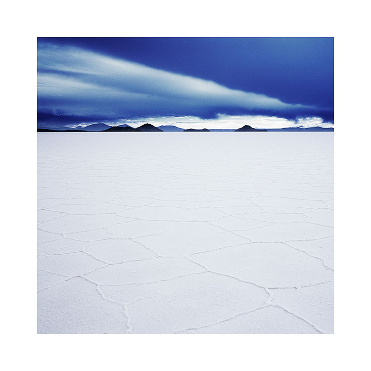
Flow or Force? Which is it to be?

I feel I've hit a creative slump right now. But I know that this is perfectly natural. No one can be 100% creative all of the time, and as with everything, there is aways an ebb and a flow.

Which makes me think about how I deal with my basic happiness in my creative pursuits. Many years ago, any creative slump would have been very unwelcome. I feared it. But I have come to accept and indeed embrace these moments because I now realise that are needed pauses in the creative process. Sometimes these 'slumps' are really periods of growth in their own way; although no work is generated, I'm sure there are things going on in my subconscious. I often feel that there are pauses before something new is to come through.

I have come to know that with creativity, it is best to not ask too much of it. To have expectations is to suppress an energy that has its own path. You can try to steer the river in a different direction but it is wasted energy that will only cause you frustration and delay the inevitable natural course that it is on.

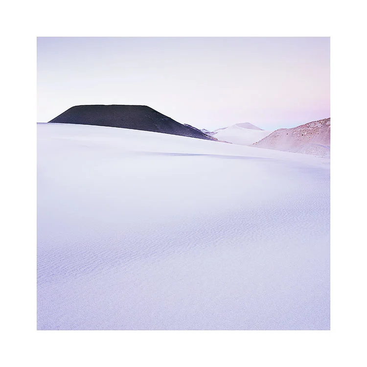
Finding flow in the landscapeLençóis Maranhenses, Brazil, 2018Image © Bruce Percy 2018

Finding flow in the landscape
Lençóis Maranhenses, Brazil, 2018
Image © Bruce Percy 2018

One of the biggest problems I see in our modern lives is the need to have immediate resolution. There is a need to fix our problems immediately, a need to know how they will pan out.

I would say ‘not knowing the answer’ is a great place to be. Rather than feeling the unease of not knowing what the outcome will be, I am now aware that when I am at this point: anything is possible, and it's very inspiring to know that there are lots of possibilities.

For me, I have come to realise that ‘trying to know the answer’, is just to force things when they're not ready to be concluded. Creativity as in life, has a way of flowing where it wants to go, and our task is to trust it and become comfortable with uncertainty. Everything has a way of following towards a natural conclusion - in it's own time. To rush it, is to force it and to wreck with natural advancement.

We have to trust. Control is an illusion and it just gets in the way. To trust, we have to surrender and let creativity take us where it feels it must. Indeed, I have found that when I go where life is guiding me, then things tend to go from strength to strength. If it feels good then you can't go wrong with that. If it's moving and flowing, then you're on the right path. If you are constantly hitting barriers or obstacles, then you are most probably forcing it and you should re-evaluate what it is that you're doing. Either it's not right, or the timing is off and you need to wait. I often find that waiting allows things to come forward and show me the way forward *when the time is right*.

Creative anxiety - the feeling you're not getting what you want, or that things aren't happening the way you want them to - is another way of *forcing it*. It is another example of you trying to control things. You have to surrender and let your creativity show you where it wants to go.

Similarly, trying to outdo yourself is not the way forward either. Your creativity naturally fluctuates. Some days we will create bad work, other days we will create good work. This means nothing except that your creativity has an ebb and a flow. So measuring yourself against your last great work is folly.

The key is to listen - when something good comes, we tend to know it, and this is when we run with it. When it’s not working, rather than being dejected or downbeat about it, just know that this period of what feels like 'going nowhere' is more like reconnaissance. You are just surveying, experimenting, testing things out. All good ideas often come when you least expect them, from things that start off as small ideas that lead to big ones. Just don't assume that your less successful work has no point to it: all of your work - either good or bad matters - it all contributes to where you are going, so long as you are willing to let it flow where it wants.

Share

You need to print to Verify your edits

I'm just home from my first printing workshop. We had a great time and as much as workshops are there to teach my participants, I always learn a lot too. No one's learning is ever complete.

At the start of the week I explained to my group that although having a tightly calibrated / profiled monitor that matches what we see in print is something we strive for: it is not ideal. The truth is, that the only way to verify what we have in our files is to print. I am not alone in knowing that even with a highly profiled monitor I can be mislead. It is only the print that is honest: it shows me what is right and also what is wrong. Errors that I did not see on the monitor become evident in the print, and once I return to the monitor to check if they were there also, I see they were there all along.

The great American photographer Charlie Cramer has often said that 'computer monitors have their own reality distortion field. The more you look at them, the more your eye adapts. The only way to see what is really in your file is to print'.  I'd sure love to attend one of Charlie's workshops sometime. He is someone I have heard consistently great things about: he sounds like a great teacher.

The thing about profiling computer monitors is that you can't trust the software. It is always 'aiming for the target you set, but often finding out that it can't reach it'. So when your calibration software says 'your monitor is calibrated', what it is often saying is this; 'I did my best'. There are a few reasons for this: firstly, depending on the monitor hardware, it may have a difficult time trying to reach the white-point and luminance levels you are asking for. I know my old Eizo lost shadow detail when I tried to calibrate it down to 100 candles. It was too low for the monitor.

I use BasICColour's Display 5 software. Below it shows you how 'close' it got to what I was aiming for (known as the delta). You can see that my colorimeter and software got very very close indeed. But this still only means that the software got close to what I aimed for. But you may be aiming for the wrong result......

BasICColour Display Calibration & Profiling software shows you just how much of a delta there was between what you aimed for, and what you got when you calibrated / profiled. You can see I chose a luminance of 100cdm, and the black point of the …

BasICColour Display Calibration & Profiling software shows you just how much of a delta there was between what you aimed for, and what you got when you calibrated / profiled. You can see I chose a luminance of 100cdm, and the black point of the monitor can't reach absolute zero, so I've set it to what it's physically capable of reaching (0.26cdm). Even with this report showing me the delta, I still need a verification test proof to compare with my monitor: the only way to confirm your profiling is visually.

You need to have something to verify against. Just because your software says 'I did it!', means nothing. If you are finding that your prints look warmer than your monitor, then you are probably using the wrong white-point setting. To find out what that should be, requires you compare your calibration with a day-light viewing booth. On the image below I have a daylight viewing booth (colour temperature is D50 - 5000K) and to match that, my computer monitor is around 5,800K. Each monitor will vary. Some may be higher in colour temperature while others may be lower. Just because I asked my calibration software to reach D65 (6,500K) means it is only a target it is aiming for. In truth, D65 on a monitor is far to cool.

You can't trust the numbers, only the visual inspection. That means iterating around the profiling / calibration software looking for a white-point that matches a viewing target. Once you find that colour temperature for your monitor, you now have a place to evaluate your prints.

Even though my monitor is tightly profiled and calibrated to match my GTI viewing booth, I still see errors in the final print that were actually present in the monitor representation. I now feel I still have to learn to 'interpret' what my monitor …

Even though my monitor is tightly profiled and calibrated to match my GTI viewing booth, I still see errors in the final print that were actually present in the monitor representation. I now feel I still have to learn to 'interpret' what my monitor is telling me, and not to trust it too much.

Once I have my monitor showing a close representation of what is under my viewing booth may I evaluate my prints. And this is where the fun begins: this is when you will find tonal distractions, colour casts and other distractions in the final print that you 'thought' weren't on your monitor. Looking back at your monitor to review, you will find they were there all along. 

The human eye is highly adaptable. One thing I have learned is that my visual system is constantly trying to lie to me. Monitors only get me so far. I have to print to verify what I think is in the file. Even if the calibration and profiling of my monitor closely represents what is on print.

I'd go one step further by adding in what Charlie Cramer has to say about the printing process:

"Poor images can look great on a monitor but will always look bad in print. Whereas great prints always look great on a computer monitor"

Your images aren't complete until you've printed them, and then further optimised them.

You have to print.

Thoughts on 'negative space', the Empty Landscape

Empty landscapes aren’t truly empty. They are governed by the same physical laws that any landscape is bound by. Light affects the surface as it would any landscape, except that subtle tonal variances are more apparent to the human eye. 

Campo-de-Piedra-Pomez.jpg

Empty landscapes also remove the temptation to get hung up on the ‘what’ and focus more on the ‘why’. Subject matter is almost secondary, and if present, is there only to support the emotional response brought on by the tonal and luminous qualities of the light. Indeed, subtle tonal variances seem to be the basis for any image-making in empty landscapes. This is what the Altiplano excels at. It offers a fascinating array of minimal landscapes under some of the most beautiful high-altitude light I’ve witnessed. 

However, it does take time to begin to see the subtle tonal variations on offer and to utilise them in one’s own photography. For example, I can forgive anyone who visits the Salar de Uyuni for the first time for assuming that it is just a vast plain of white. To the uninitiated, that is all there is. However, to the experienced photographer who has photographed this place many times, the salt flat provides endless variances of tonal response across its flat surface. So much so, I don’t feel I have truly been able to capture the essence of it because part of its beauty is in the transient nature of the light that plays upon it. 

Salar de Uyuni, Bolivia, Image © 2009, Bruce Percy

Salar de Uyuni, Bolivia, Image © 2009, Bruce Percy

Making images here is difficult because the human visual system is not capable of seeing true dynamic range. We are essentially blind to gradual tonal variances and often confuse two different areas of a subject as having the same luminance or colour when in fact they differ greatly (have you ever cloned one part of the sky over another area thinking they both exhibit the same tone, only to find they vary greatly?). This begs the question: If our eyes deceive us while reading tones in the landscape then what else are we oblivious to? Quite a lot, I believe. 

But, we can and do learn from empty landscapes. Whereas, busy scenes hide distractions and tonal imperfections because our eye is far too busy absorbing what’s there, empty landscapes are uncompromising in showing us subtle problems once we begin to ‘see’.

Campo-de-Piedra-Pomez-2.jpg

Just like any small problem when magnified, what may be acceptable under other circumstances soon becomes quite glaring and annoying.

As a result of working in empty places, I have become more selective to the kinds of tones I wish to record, and this I believe has pushed my photography and my visual awareness forward. 

If I were to sum up what I think photography is for me, I would say it has been a life-long study of tone and form and of improving my own visual awareness. I started off blind, not really seeing or understanding what was truly before my eyes, often over-complicating my compositions. As a result of this, it has taken me a long time to learn to 'see what is really there', and to reduce my compositions down to their essential elements. 

I believe I understand now that less is often more and, even then, less may be still too much.  Ultimately, I have begun to see, that empty landscapes aren’t really empty at all. 

Share