Printing's role as the final stage in image verification

Back in the days when I didn’t print, and asked a pro lab to do it for me, I always had a nagging feeling that I’d lost control of my baby.

I’m a self-confessed control freak when it comes to what I do. A few days ago I wrote a blog post about appetite because I think I know appetite well: whatever I get into, I never seem to get into it in half measures.

Screenshot+2019-03-17+at+09.53.56.jpg

Knowing this about me, you may be surprised to find out that at the beginning of my photographic journey, I often got my images printed by a lab. Indeed, I only started printing about 10 years ago.

For a long time I shied away from tackling what seemed like a formidable mountain because colour management was like a black art to me.

So I stayed away.

I’ve been extremely fortunate to have this blog. It has allowed me to meet people who have helped me and I put out a request about a decade ago for some help and suggestions about printing. Not one person left an entry on the blog, but instead chose to email me privately about it. The emails usually had this format to them:

“I don’t want to get flamed for my opinion, but this is how I do printing”.

It seemed that printing was a religion and to say you had a different way of doing it to someone else’s way was often contentious. A point of view is just that, and yet I am often surprised that we feel threatened when someone has a different view from ourselves.

Well, I welcomed the input but the message I got from the replies was this: everyone has their own way of working.

I doubt things have changed much in that regard over the past decade. There is still a lot of ways you can slice an onion, and there is always going to be a huge amount of fact vs personal preference.

So it’s now a decade further on, and I feel I know a thing or two about printing now. Indeed, I feel that everyone who loves photography should print. For one very simple reason: to validate your edits.

Even with a well calibrated and profiled computer monitor, I have learned that I cannot 100% trust it. I think it has something to do with how the eye interprets transmitted light compared to reflected light.

The fact is: I often notice areas that need further work when I study a printed version of an image. Stranger still, I often find that once I notice the error on the print, I can now see it on the monitor also. But the opposite is not true.

So printing is your last verification stage, and to paraphrase the wonderful Charlie Cramer :

“images that look good on a computer monitor aren’t guaranteed to look good in print,
but good prints are guaranteed to look good on a computer monitor”

Well, the issue for most who don’t print is: how to get started? It seems like such a black art. Yes, it is difficult to get started. There is so much contradictory advice out there. There is no one single way to do this correctly (even if I think my process is good).

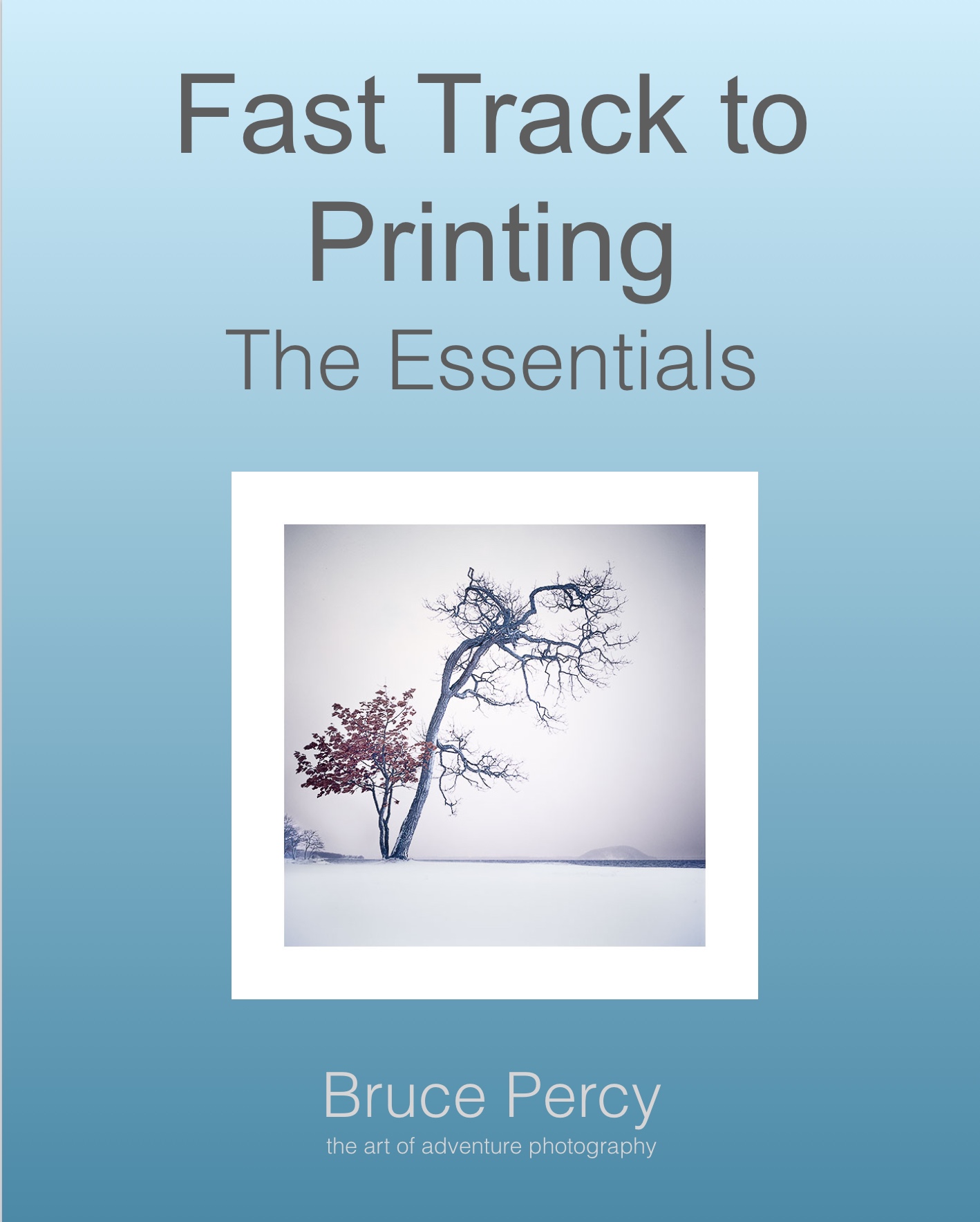
I think this is why I’ve chosen to attempt to write an ebook about it. If I can reduce the information down to what you need, rather than getting too lost in the technology, then maybe I might be able to help you get a head start with this. I’ll see how it goes, but so far I’m feeling good about how much I’ve written. I think it’s coming together really well.

On buying new equipment

I’m a gear head. Let’s face it, we all are. Aren’t we?

I just don’t like to write about it much, because there’s already too much of that kind of thing out there. Buying gear, and focussing on gear is much easier to do than actually working on improving our craft. And if we’re time-poor (which most of us are) then buying gear is an easy way of satisfying our desire to be out there making pictures.

I haven’t tired Lee’s new filter holder yet. And as much as I’m a self-professed gear head, I’m going to withhold from getting one.

No slight intended on Lee, or their filter holder. I’m sure it’s a wonderful product as I think original holder was a well made piece of kit.

It’s just that my current working process is working. Hence why I called it a working process. I don’t need to change it right now.

And this is my reason for writing today. If you have a process that’s working fine, then try not to mess with it too much. Ok, I appreciate that staying stuck in the mud for too long isn’t good either and it’s always worthwhile trying out new things. But I think there’s already too much of that. It’s so easy to get new things, and it’s so easy to change a working process without really understanding how it’s going to impact you.

I’m sure I’ll eventually try out the new Lee filter holder. But I’ll do that when my current holder gives out. But so far, over the past two decades, they’ve been pretty darn good and I’ve never had much complaint about them. I always felt that the Lee holder was one of the best holders out there.

Perhaps the new holder is better though. Well sure, that might be so, but I’m unwilling to go through the hassle of getting familiar with it. So often I’ve adopted a new piece of kit only to discover growing pains in getting used to it. For example, I once dropped a camera into a river because I wasn’t familiar with the clamp on a new ball head I had just got.

My process is pretty good right now. It works very well and I feel that all my equipment is like a comfortable glove. It doesn’t get in the way and I’m able to get on and do what matters : make images.

Appetite

So a few days ago I wrote about appetite.

I deliberately left it open and didn’t continue to expand on what I meant. My reasons were two:

  1. that I think if you’ve got it, you would know what I meant.

  2. and if you didn’t know what I meant, you might be prompted into thinking a bit more about it.

The web is full of self-help stuff. Most of it has a short-term feel-good factor but it’s rare that things we read stay with us the long term.

we’ve got to do the work. And we’ve got to be clever about it.

Me explaining things all the time isn’t you doing the work. It’s me doing the work, and you choosing to tune in, and tune out when you feel like it ;-)

Fjallabak-(6).jpg

The thing about appetite, is that it can be whatever you feel it means to you.

You may define it as ‘drive’, you may define it as ‘effort’, or ‘talent’.

But I’ve known many talented people who never complete things (that’s ok - it’s no judgement - do what you want to do), but I mention this just to illustrate that having talent alone doesn’t make someone a great photographer. Neither does working hard. I’m not a big fan of the 10,000 hour view that if you put enough time into something, you’ll get better. You can spend a lot of effort running in a circle.

I think good artists are self learners. They are able to use their time to learn from themselves as they go along. I’d dare to say that most great artists didn’t get to where they are because of an art class they took. Sure, the art class will have given them skills and new ways of working, but they had to spend the time and effort joining the dots, making the connections and finding their own path. In other words, at some stage : they took hold of the responsibilities of their own development.

That’s the appetite I’m talking about.

Having the aptitude to grow is one thing, but wanting to do it badly enough is another thing entirely.

If you really want to improve in your photography then there are no shortcuts. No quick fixes, no instant results.

We all have to do the work.

And we have to have the appetite to do it.

The rarest quality

Everyone is hoping to improve their photography skills. Skills can always be learnt.

But there is one thing that is much rarer than skill, and it’s something that can’t be learnt.

It’s called appetite.

Hokkaido-2019 (10).jpg


Colour compression & colour spaces

I’ve been working on some notes about printing lately. So this post today is all about colourspaces and what happens when we move an image from one colour space to another.

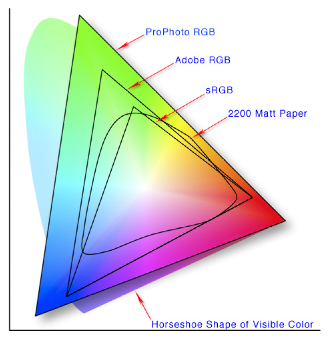
In the article I point out that colour management is not about colour accuracy, but more about how we choose to work around physical limitations as we move from one device to another, each with different colour gamuts.

2200 Matt paper has a small colour gamut, than Pro Photo RGB. So what can we do to make our image look good on 2200 Matt Paper even though it is physically impossible to do a direct conversion?

2200 Matt paper has a small colour gamut, than Pro Photo RGB. So what can we do to make our image look good on 2200 Matt Paper even though it is physically impossible to do a direct conversion?

The problem

Each device has its own physical limits to the range of colours it can record or reproduce. This is the problem: what do we do as we move an image from one device to another?

For example, when sending a file with a wide gamut of colours to a monitor or printer with a smaller gamut of colours, something has to be done with the colours that fall outside the physical range of the device’s effective gamut. Do we ignore those colours, or should we do something else with them?

The solution : Rendering Intent

The answer is : we decide, and we tell the colour management system our decision by way of a feature called Rendering Intent. Rendering Intent is where we tell the colour management system which rules to apply with respect to out of gamut colours.

There are several different rendering intents available. The two most commonly used rendering intents are Perceptual and Relative Colourmetric, which kind of do this:

Perceptual : shrink all the colours from the larger colourspace to fit the destination colourspace.

Relative Colourmetric : out of gamut colours are clipped, moved to their nearest relative within the new colourspace. All the other colours remain unchanged.

That’s a brief summary. Let’s consider them in more detail:

Perceptual

This rendering intent as the name suggests tries to adjust the content of the image so you perceive it as similar to the original image even though the colourspace is smaller. It does this by adjusting all the colours while keeping their relationship to each other intact. Although it is not ‘colour accurate’, most photographs look about right when it’s chosen as more often than not, it’s the relationships between the colours in the picture rather than their colour accuracy that is important. Here is an illustration to show how all the colours are shifted to fit the new colourspace:

Rendering-Intent-Perceptual.jpg

The other most common way of working around out of gamut colours is to choose relative colourmetric:

Relative Colourmetric

This rendering intent keeps all the colours that were within gamut unchanged. It’s a useful rendering intent when you want to ensure colour accuracy for certain colours - perhaps skin tones for example. Only the colours outside the gamut are clipped. They are moved to their nearest available in-gamut colour relative. As you can see below:

Rendering-Intent-Relative-Colourmetric.jpg

As you may now realise, colour reproduction is a compromise. And colours often have to get compressed if we are moving from a device with a wide gamut to a device with a smaller gamut.

We have to make the decision about which rendering intent to use. And the best way to choose the right one, is to demo them. If you are printing, then under the proofing preview, you can move between the different rendering intents to see how the colours are changed. Choose the rendering intent that suits your image the best.

No right or wrong way

Rendering Intent is best auditioned on a per image basis. Further, although an image may suit one rendering intent when printed on paper X, you may find that the same image prefers another rendering intent when printed on paper Y.

So you need to experiment on a per image basis.

But what about monitors? Do we have to compromise with them also?

As it happens, yes. Standard monitors have their own colour spaces (profiles), and when viewing something that comes from a larger colourspace on the monitor, a compromise has to be made.

Monitor Profile Rendering Intent

From what I understand, Monitor profiles are matrix based and this means that they have no idea how to deal with out of gamut colours. So they are simply clipped. In other words, when displaying out of gamut colours on a monitor, the monitor is essentially using a rendering intent of ‘Relative colourmetric’ (as illustrated above). We don’t have a choice about rendering intent when displaying an image on a monitor. It’s always ‘relative-colourmetric’.

In the diagram below, I have a Pro Photo colourspace image open in Photoshop, but I am viewing it on a monitor that has a smaller colourspace than Pro Photo. The colour management system responsible for the conversion from the image profile simply displays the colours unchanged, and any colour that it can’t display is just clipped to its nearest relative within the monitor colourspace.

monitor-profile-rendering-intent.jpg

In summary

  • Colour management is not the same thing as colour accuracy.

  • To manage colours, we need to have profiles that describe the colour gamut of each device, but we also have to make decisions on how to deal with colours that fall outside the gamut of a particular device. This is called the rendering intent.

  • We can choose which rendering intent to use when printing.

  • But we have no control over how out-of-gamut colours are displayed on computer monitors, they are just clipped to fit the nearest colour within the destination colour space.

Cameras and Colourspace Confusion

A lot of photographers think that the colour space option of ‘sRGB’ or ‘Adobe RGB’ on the back of their camera is used to set the colourspace of their camera.

It doesn’t do that.

The colourspace settings are only for the jpegs that are produced in-camera.

RAW-Conversion.jpg

RAW data is unaffected. Indeed, RAW can’t be modified. Think of RAW as a 'negative’ that comes out of an old film camera. The negative can never be changed once created.

So the ‘Adobe RGB and sRGB’ settings on the back of your camera are just for any jpegs that the camera ‘generates’ from the RAW capture .

If you are shooting RAW all the time, then you don’t need to worry about colourspaces while shooting.

Q. So when is the colourspace important then?

A. When you open your RAW files

When you open (or import), you are translating, converting the content of your RAW file into the host software’s format. In Photoshop’s case, you always go through the Adobe Camera Raw software before the image is available in Photoshop. It has to go through this translation stage.

The Raw Converter is where you can set the colourspace and it’s really important to pick a colourspace large enough to contain all the data that your RAW file has.

Effectively speaking, RAW files have no colourspace that you know of. Well, it’s a bit more complicated than that, but when you open up in Photoshop, you have to go through the Adobe Raw Converter. This is where you choose the colourspace and the RA…

Effectively speaking, RAW files have no colourspace that you know of. Well, it’s a bit more complicated than that, but when you open up in Photoshop, you have to go through the Adobe Raw Converter. This is where you choose the colourspace and the RAW file is translated to that colourspace.

Pro Photo is the colourspace to choose, because it is a large enough container - much larger than Adobe RGB, and most likely much larger than any colours your camera can record.

A not too accurate illustration to show that Pro Photo is a larger colourspace than Adobe RGB. You should open your RAW files in Pro Photo.

A not too accurate illustration to show that Pro Photo is a larger colourspace than Adobe RGB. You should open your RAW files in Pro Photo.

If you choose Adobe RGB you may be clipping (throwing away) some of the colours that your camera can reproduce, because your camera may be capable of recording colours outside of the Adobe RGB colourspace.

The best option is to open up your camera files in Pro Photo. It’s a larger colour space and won’t clip the data. You’ll keep all of the colours in your file.

Q. But doesn’t the RAW format have it’s own colourspace?

A. Technically speaking there is a lot of splitting hairs about this. Some say no, some say yes.

The camera has its own proprietary way of recording the data, and this ‘specification’ is given to the developers who write the RAW converter engine. It’s up to them how they translate the information and this is why RAW converters vary (please note this is a serious oversimplification here).

Q. Why keep all the colours if your monitor or printer uses a smaller colour space?

A. Because the more data you have while editing, the better

Your camera is a glorified computer that just stores numbers. Photoshop just reads numbers, and when you alter a photograph you are truncating those numbers. It follows then, that the more data you have, the less chance you have in introducing weird problems into the file when you edit or adjust it in any way.

Although you cannot see all the colours present in Pro Photo because your monitor maybe has a smaller effective gamut, you still get the benefit of having more data to play with while editing.

In summary

  • The colourspace settings on the back of your camera are just for the jpegs it ‘generates’ from the RAW files.

  • The RAW files are unaffected and can’t be changed.

  • When you import a RAW file into a photo editing program, it has to get ‘converted’ or translated. This is when you need to choose a colourspace

  • Choose a large colourspace otherwise you may truncate colour data

A few thoughts on writing e-Books

Over the years, I’ve been writing e-books with the aim that they become more ‘reference’ material than something attributable to magazine content.

When I put ‘Simplifying Composition’ together, it took me about a year to really think it through, to figure out what I needed to say and to then formulate it on paper. It’s not the writing that takes the time, it’s the idea, the concept, and the arrangement of the words so that the message is as clear as it can be.

And that was the hardest part of all - figuring out what it is that I needed to convey in writing. The message needed to be simple. It needed to be clear, and for that to happen, I needed to be clear myself with what I wanted to say.

It is often in the process of explaining something that I find holes in my own knowledge. If I’m finding it hard to explain something it’s usually because I don’t fully understand something as much as I thought I did. Writing an e-book is a self-learner, a process of self-help. Of clarifying my own ideas and filling in the gaps in my own knowledge.

Writing an e-book about Photoshop was similar. It took about 2 years for me to do this one. I think the first year was mostly procrastination, brought on by a feeling of difficulty. You see, Photoshop’s tool set is huge. And the truth of the matter is that photographers only need about 10% of the program.

It took me a while to realise that most Photoshop book are like reference manuals. They may be in-depth and tell you everything about the program, but they suck at getting you off the ground, of cutting out the chaff, and of getting you to the tools that you really need to know.

So it took me a while to figure out that photographers just need to learn Layers, Masks and Curves to get going. Write an eBook about those features and you’ve given everyone a head-start, a push in the right direction, rather than getting lost in some massive reference manual with no idea where they are going.

How does one write a book about printing?

And this is the problem I’m at right now.

The subject of printing is massive. It has to cover monitor calibration, monitor profiling, profiles, proofing, colour spaces. Each of those is a massive topic on its own, so I have come to realise that I need to have a ‘fast track’ way of cutting out the noise, of cutting through all the technology to get people up to speed as quickly as possible.

But there is so much miss-information and miss-understanding out there.

fast-track-printing.png

Many think they need to profile their printer, many think that their camera works in Adobe RGB colour space.

Many think that all devices work in Adobe RGB colour space when in fact they don’t. They work in their own proprietary colour space and the colours they’re capable of recording or reproducing may not fit exactly any particular colour space - they have their own personal signature.

Similarly, so many people think that their printers work in RGB, they don’t. They are CMYK devices. Just go and look at the ink sets used on any Epson Ultrachrome ink printer - there’s a clue in the names - Light Cyan, Light Magenta, Yellow…. . So although there are beliefs out there that CMYK is a smaller colourspace than Adobe RGB, it’s not true - they’re just different,.

Lastly, understanding printing is about understanding that everything is a compromise.

So too, is writing an e-book about it.

The lone tree cliché

I know, trees are such a cliché aren’t they?

But I think that often a photograph isn’t about the subject. It’s about the treatment. It’s about the sensibilities applied.

Everyone can take a photo of a lone tree. But what we should be aspiring to, is to convey a level of excellence, of elegance, of beauty that is above ‘just another picture of a tree’.

Doing what everyone else is doing means you just disappear into a sea of sameness. But you can avoid it, I believe, if you try to set your work apart in some way. Often that can happen, not by the subject matter you choose, but how you choose to shoot it, and how you choose to edit it. Often the excellence is in the execution of the work.

Landscape as director

I’ve just had to accept that certain landscapes are what they are. They have an uncanny knack of knowing how to direct you: they tell us what needs to be done. We just have to listen.

Therein lies the problem. Most of the time we don’t listen to what the landscape is telling us. Instead, we often try to force upon it what we want. What we are looking for. Instead, we shouldn’t be looking for anything. We should be a clean slate, ready to work with whatever conditions we are given.

How many of us go to places with pre-visualised expectations? Hoping to get a certain shot we’ve seen before, or the same conditions?

I’ve been having problems this past year with my use of colour. Or perhaps the lack of it. I was very happy to find that my South Korean image had quite a bit of colour in them. I feel there’s been a pendulum-swing as I’ve gone from reducing colour further, and then further still, to feeling I’m starting to re-introduce it into my work.

Not so with Hokkaido.

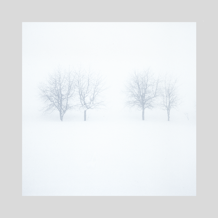
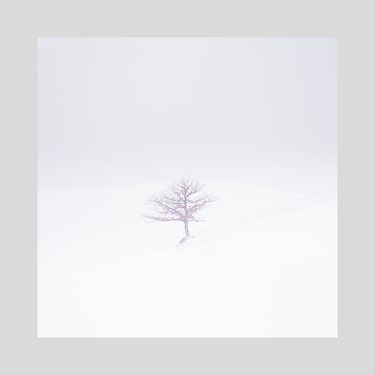
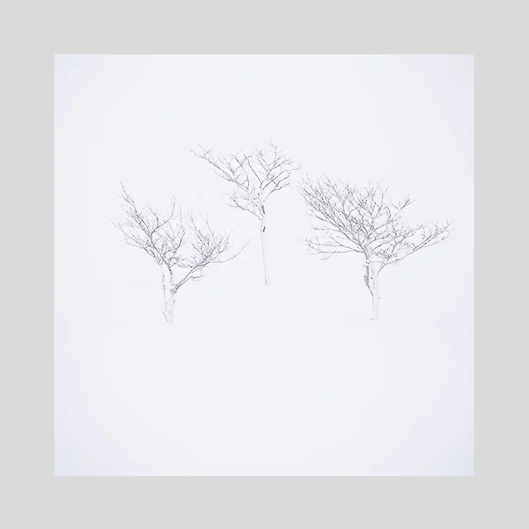
As you can see above. These images may ‘appear’ to have little or perhaps no colour to you. All I can say in my defence is : it’s what the landscape directed me to do. I can’t make the landscape be anything it isn’t and rather than have an up-hill struggle to make it so, if I follow what the landscape tells me, things just tend to ‘flow’ much easier.

Hokkaido is not a landscape of strong colours. But it does have them. I think the art in making good photos of Hokkaido isn’t necessarily about working with negative space. Neither is it about working with snow scenes only. I think it’s about working with tone and colour responses. These are where the emotion of the picture reside.

Snow is not white. Neither is it just one continuous tone. Snow is a vast array of off-whites, with subtle graduations running through the landscape. Our eyes are often blind to these subtleties as we start to photograph it, but with some well informed time behind the computer monitor editing and reviewing, we should all come to learn that white has a tantalisingly vast array of shades and off-white colours.

Hokkaido has been my director. It has guided me in my lessons over the past four or five years. I’ve learned so much from working in this landscape when I have chosen to listen to it.

Today, colour seems louder than it was yesterday

I’ve just completed work on some new Hokkaido images. The past few weeks have been a journey in colour reduction and more specifically: colour use. Reduction can be done by anyone, just turn the colour down. But to apply colour sensitively, takes skill and a whole lot of consideration and doubt.

Hokkaido-2019 (29).jpg

Now that I’ve finished the Hokkaido images, I’m struck by how little colour there is in them. Yet if I try to put the colour back in, they just sit wrong. They don’t work. They need to be the way I’ve edited them.

Looking at my website main page today, I was struck by a feeling that there is simply too much colour. I don’t think that’s true one bit, but what it is telling me is that I’ve been working with such quiet, muted tones this past week, that somehow, every colour feels strong for me at the moment.

Hokkaido-2019 (17).jpg

Our visual perception is often changing, and I think for me, it’s as if it all depends on how I feel today. Tomorrow I may feel otherwise, find that there isn’t enough colour. All I know is, that colour needs to be used carefully, and applied only when it’s required. You can create some noisy, complex images if you let the colour run riot.

Perhaps my sensibilities are changing yet again. Perhaps it’s just a moment. A passing phase. All I know is, that today, colour seems louder than it was yesterday.