I believe photography allows us to open up an internal dialogue with ourselves, one where we are able to ask questions of ourselves and our world and be free to interpret at will. I think that's one of the reasons why I love photography so much, because there are always things to be learned about the world, and also about myself.
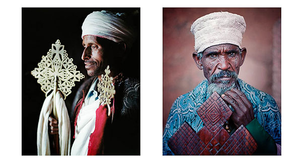
Portraits of Deakons, Orthodox Christian Lalibela, Ethiopia, © Bruce Percy 2010
I've often felt that the learning tends to come during the act of making pictures, or much later on, once I've had time to consider and reflect on the experiences and also the results from a photographic trip somewhere. For instance, the new set of photographs I published a month ago of Iceland are still perhaps too fresh for me to get a clearer understanding of what I've created. I'm sure over the coming years, I'll gain a clearer understanding of what I was doing, and why I was doing it.
The main thing for me is not to impose any set of expectations of rules onto what I either wish to create, am creating, or have created. It is what it is, and I fully accept what it is. In this way, I am receptive to understanding its successes and failures and at the same time, not judge it.
I've been thinking today that language, or more specifically, the choice of words we use when we talk about our art can be a clue to how we feel about our creative selves. For instance, I sometimes hear others talk about their work in the sense that they have to 'strive', 'push' or 'challenge' what they are doing. For me, I like to use words such as 'flow', 'embrace', 'discover' and keep things 'open' to whatever may come.
So I've been wondering about this. Why do many photographers talk about their art in a forceful way? Surely the words 'challenge', 'strive' and especially 'push' suggest a need to change and by exerting some kind of rules of force upon what you do - then the change will come?
In the arts, change does not come from challenging or pushing oneself. It only leads to expectations and expectations lead to writers block. Writers block is a symptom of setting goals and if you're unable to achieve them, a feeling of not going forward ensues. Before long, a feeling of stagnation begins to pervade your creative efforts and you loose confidence and faith in yourself. And before long, something you always turned to, to give you inspiration and joy in your life is no fun at all.
Creativity needs to be nurtured, cared for, tended well.
And this means banishing thoughts of pushing oneself forward, or of striving. Things should not be difficult. If they are difficult, it is only because you have made them so, and it is best to stop and leave it a while so it can find its own flow again.

Portraits of Kathmandu, Nepal. © Bruce Percy 2009
You may be forgiven for thinking that I've got it sussed. That I know how to avoid these stagnant moments, or times when I feel I'm not going anywhere in my art, or I've maybe given you the impression that I never suffer from this affliction. Rest assured - the main reason why I feel I have such a grasp on why language such as 'strive','challenge' and 'push' are bad, is because I've found them destructive forces in the past.
I have indeed suffered from moments when I've felt lost or stuck with my art, and I still get them. Only recently, I'd been feeling a sense of stagnation with regards to my portraiture work. I simply hadn't had any free time over the years of running my workshop business, to go make some new images of people. The trouble I had, was finding a group of people that I felt a connection or desire to go make photos of. Rather than force it, I just decided that the answer would come sometime, and it did. Just the simple act of watching a movie about the last Geisha was perhaps the catalyst. I thought about how beautiful Geisha are and I've always felt that if I am to photograph anything, it should be because I think it beautiful. Before I knew it, I was buying books on Geisha, reading up on their history, and it just grew from that. Months later a plane ticket was bought and a plan had been formed..... I'd got my inspiration back.
These days, I feel I have a better understanding of my creativity and how it works. It has its own flow. Things happen when they happen and I can neither control or will it to happen. It just does and sometimes it just doesn't. When it's not happening, I'd much rather not force it, so I tend to put the camera away and go do something else instead.
My creativity tends to flow when I am not putting pressure on myself, but just being in the moment, with no expectations or preconceived ideas of what I might create.

Portraits of Geisha. I'd been feeling a sense of stagnation about my portraiture work, and since I'd always had a love for the beauty of Geisha, felt a real desire to go make some photographs of them in 2014. © Bruce Percy
Next year, in 2015, I've set aside more time than usual in my calendar for some personal projects because I feel there's been an imbalance between my working life and creative life. Running a workshop business is fun, and it's creative in the sense that I am dealing with other's creativity, but I've been feeling a neglect towards my own creative needs.
So in 2015, I'm heading back to Ethiopia to revisit the sacred town of Lalibela for a special orthodox christian celebration. In February I am returning to Japan to photograph more Geisha, and in April this year I will be heading to Bhutan for the very first time.
I don't know what these trips will bring, and I love not knowing. I feel that the possibilities are open for things to happen as they happen, when they happen and if they don't, then so be it. It's just the way it is.
I also have no idea of what I will learn about myself or my art until I have made the work. I'm just looking forward to finding out things along the way, opening up a dialogue between myself and the world I am interpreting through my camera and seeing where it takes me.
Photography is a gift. It is an invitation to explore the world and oneself. It is a passport that says 'find out more'. It is a creative outlet. It should not be challenged, or forced at will to perform. Just go with it for the journey and I'm sure, over time, it will enrich your life more than you had ever imagined.
Be kind to your creativity.