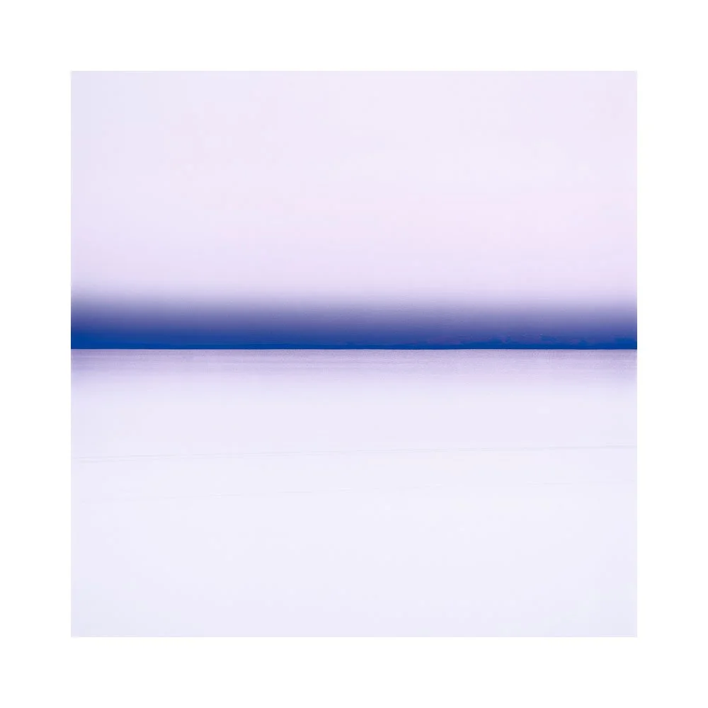
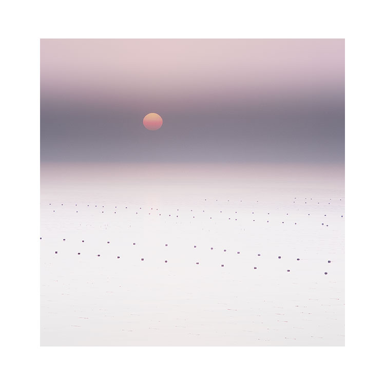
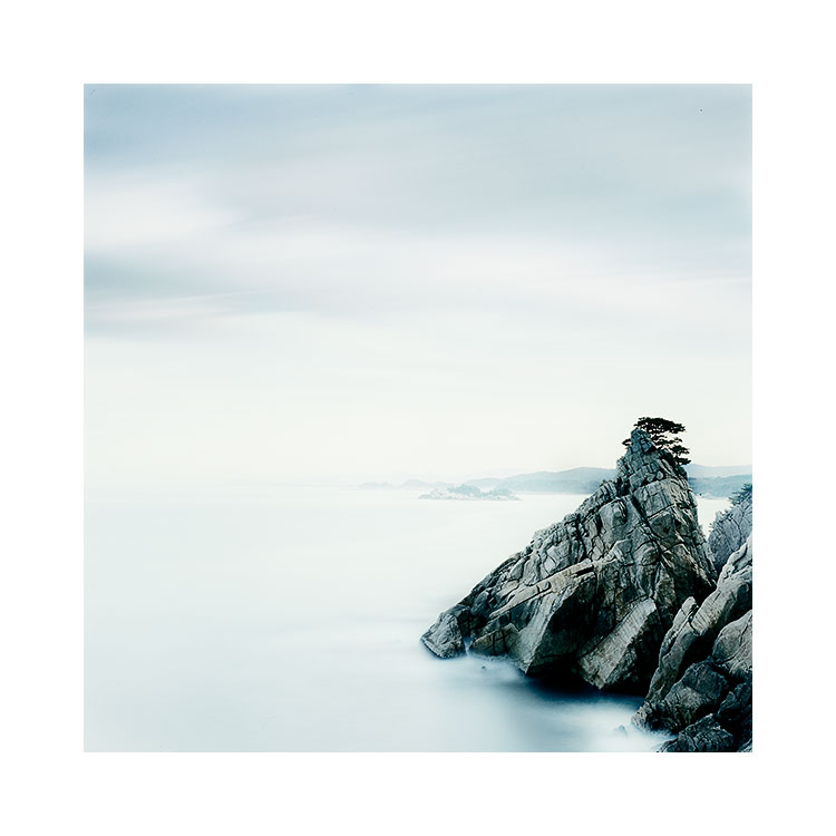
Osmosis happens when you keep returning

Osmosis

the process of gradual or unconscious assimilation of ideas

I feel that my latest images from Bolivia are really the result of cumulative visits over a fourteen year period. I couldn’t have produced this set of images on my first attempt fourteen years ago sure, because I was a different photographer back then. But at the same time, even turning up now, knowing what I know, I don’t think the work would be the same. I am sure that the previous fourteen years have provided time for my unconscious mind to assemble and process what I’ve seen / felt / experienced coming to the altiplano repeatedly over so many years.

Yesterday I wrote about the importance of not discarding a landscape too quickly. I hear people say all the time ‘I’m done here’, or ‘I won’t be going back as I didn’t find much there’. Often times, the reason why the landscape offered little has more to do with our own lack of ability than anything. Or we simply fail to understand that some landscapes don’t reveal their best work immediately. Some require a lot of work, and some you need to coax the best you can get out of them over an extended period of time.

Osmosis can only happen if you keep returning. Even for landscapes we love and feel we’ve reached the end of the road with. I am aware that there have been occasions where I felt I couldn’t find anything new to shoot in Bolivia because I had been going for so long. In these circumstances I often find a hiatus of a few years can help me return with a fresh perspective. Either way, assuming that your work with a landscape is done, is a limited and self-restricting view.

‘Sometimes when I think I can’t go any further,
I discover a few years later that I had only really just begun’

For me, Bolivia has been, and still is a teacher. It has shown me how to get more clarity in my work over the years and how to push the envelope in simplifying my compositions. Even though I thought maybe five years ago or so that I had reached the end of the runway with this landscape.

This year, I felt the work had moved to something a bit more abstract and minimalist than I had achieved previously. All I know is that I’ve had many different phases in my relationship with the Bolivian landscape and this new work from this year has confirmed that there is still mileage to be found in a familiar place.

Tthere has been a process of osmosis at play in my photography from the very beginning. I feel most of us greatly underestimate that the invested time we spend in a landscape - even one we find difficult, contributes to our development and learning. Bolivia is just one of the sub-plots in my work and by looking at it in isolation, I have been able to see clearly that it has had an impact on the other locations I visit.

‘my experiences of a landscape not only affect it,
but also spill over to affect every other landscape I spend time with
It is all encompassing and cumulative, it all feeds back into itself.’

Landscapes that I have found challenging, or limited can be learning experiences. I am aware through my repeated visits to Bolivia that my relationship with this landscape has fluctuated like any other relationship. Sometimes I’ve felt I’ve hit a wall, other times I have felt progress. No matter what, I still keep returning. I still keep turning up. Because to discard a landscape because I found very little there is self-defeating and ultimately self-restrictive to my photography.

Share

Do you discard landscape too quickly?

I’ve said previously that all photographers need to find the landscapes that resonate with them and keep working them. If there is a mismatch and you visit a landscape you don’t quite get, then rather than diss the actual landscape and say ‘there was nothing there’, it would be more accurate to say ‘I was unable to connect with it’.

As a workshop and tour leader, all the landscapes I go to are of value. But whether you are going to get them is really down to where you currently are in your own artistic space.

If you’re not ready, then you might struggle. If the landscape is too difficult, or not so easy to work with, it might simply be that it requires more investment than you had imagined. I am of the firm belief that not all landscapes are equal, not just in terms of beauty, but also in terms of how much you have to work at them.

Just because you may have found a place difficult, or found it didn’t offer up as much rewards as another place, doesn’t mean it’s a place to forget about. For me, I have returned many times to places that I found difficult, because at the core of my feelings about them, I knew there was more to be found there, but it would take some time and effort.

South Korea was exactly like that.

During my first visit there, I remember thinking that I was going to come home with no good images.

I was so wrong.

The place was very difficult to work with, and I shot a lot less film than I normally do, but in retrospect, I got one of my own personal favourite portfolios out of it.

I have since been back to South Korea and my second visit was even more difficult than the first. But I still think there is something of value to be found in South Korea and I should keep returning.

This taught me that I should avoid judging landscapes. If I’m not seeing anything there, then the issue is most probably me. No, it is me.

The other aspect that I’ve found interesting to deal with is preconceived expectations. I think being on social media can lead one to expect that your own images of a place will be on par with what you’ve seen elsewhere. This is dangerous territory to be in and can have at least two downsides as far as I can see:

1) Going there with preconceived ideas of what a place looks like, might mean you’re only able to see it the way it’s been shot countless times before.

2) if the scenery does not match what you had anticipated, you may be disappointed, and not able to ‘connect’. If that happens, you’re definitely not going to be able to see an alternative view that it may be offering you.

Both of these approaches is due to one having the illusion of control. Landscapes, often remind me that I have no control over them. But what I do have control over, is how I choose to deal with them presenting me something I had not anticipated.

I try not to diss landscapes. Often times when I do, I know deep down that what I’m really doing is offsetting my own lack of ability to find something there. I will often excuse my poor experience away as a problem with the landscape, when ultimately the problem was with me.


Life isn't a rehearsal

Well, I actually hope it is. But perhaps that is a discussion for another time :-)

But I’ve been thinking today that we are all essentially the cumulation of our memories. What defines us is what we’ve experienced and seen.

As I age, I’m aware that time is the rarest commodity I have. But I think I often forget that it’s not how much time I’ve spent that is important, but more the quality of the time spent. And whom I’ve spent the time with.

I am still very much getting over some personal grief. I was extremely close to my dad and although it is now approaching three years, he is often on my mind. I treasure all the fun I had with him, and his passing is a stark reminder that ‘all we have is now’. It is only in grief that we can realise how precious time is, and how precious the connections are that we have formed with others.

Wealth isn’t money. Wealth is in living a life of meaning. And to get meaning in our lives, we have to form connections.

I would like to thank Ulana, Geoffrey, James and Steve for coming to Hokkaido this Autumn with me to help me research a future tour here. As you may already have figured out - I love Hokkaido and Japan. Although I always go in winter time, I have for some time wanted to find out what Autumn is like.

I am now wondering ‘what’s next?’, where to go next on my adventures? Because I realise that investing in one’s future memories is an important thing to do. And this I think, is really at the core of why we all take pictures. We don’t just want to record things because they are beautiful or interesting. We record them because they are part of our own visual journal through this incredibly wonderful thing we are all experiencing called life.

Share

Manual or Aperture Priority?

This is a re-post. This article was published February 2020. I’m going to re-publish articles from my extensive blog as I think many of them are still relevant.

This article deals with using Aperture Priority along with grads to work out your best exposures. I’m aware that many use manual, but if you read below, you may see why I think AP is a good mode to work in.

Each year I get participants using Manual mode for almost everything they do. Today I’d like to cover why for me I would tend to use Aperture priority (along with exposure compensation) for most of my work. The only caveat about this is that when you get into very low light situations, most cameras prefer to work in Manual. They somehow fail to be able to give sensible readings in AE.

My main reason for using Aperture Priority above anything else is mainly due to this:

‘when using grads along side aperture-priority,
the camera automatically re-balances the exposure’

Consider the diagram below. On the left I show how the exposure of sky (blue) and ground (green) are worked out. Bear in mind that the light meter inside your camera just sums up all the tonal differences and takes an average (if you’re not clear on metering, see the previous article Light meters are dumb, they just try to turn everything 18% Grey).

exposure-grads.jpg

The main point about this diagram is:

  1. Before applying a grad, the camera just has to take an average between sky and ground. So the ground is underexposed and the sky is over exposed.

  2. When applying the correct strength of grad, the sky gets darker (as we have been taught - this is what grads do - they darken the sky). But something else happens as well………

The ‘something else that happen as well’ is this:

  1. The ground gets lighter.

Why is this? Well if you study the diagram, and think about it for a little bit, you can quickly see that if you apply a grad, the difference in stops between the sky and ground is reduced. Since the camera’s light meter is looking for an average, the new mid-point is much less further away from the sky and ground tones. In other words, the contrast range has been reduced and the light meter just picks a new average between the new light and dark tones.

When working in Aperture priority, the average exposure is being computed in real time. You can even see it adjusting the mid-point exposure as you push a dark grad down on the frame. As you do so, the ground gets lighter, because the difference between sky and ground is reduced.

This doesn’t happen in Manual. You don’t give the camera a chance to automatically re-balance the exposure for you.

Manual isn’t always the way to go

For me, I would shoot in Aperture Priority for most of my work. I’d prefer to do this because each time I apply a grad, the camera just recomputes, and works out the new average meter reading for the scene.

Before I am shot to bits by people declaring that I think Manual mode is bad. I’d like to make very clear that Manual still has its place. Often times when working in very low light, most cameras give up metering in Aperture priority, and so I have to resort to using Manual for these times.

It’s just that in Manual, you don’t see the ground lifting up in value when applying the grads. So I prefer to use Aperture Priority when I can.

Aperture Priority + Exposure Compensation

If it were me, all cameras would be designed to have just these three elements:

Aperture Priority
Exposure Compensation
Manual mode

Because most of the time, aperture priority with a bit of exposure compensation is all that’s required. Sometimes I need to go longer than 30 seconds, or need to set up the camera is very low light, so I’ll resort to Manual.

Grads are still valid

If you’re a digital shooter that believes you don’t need grads, I’d like to urge you to think again. There are many benefits of working with grads:

  1. As pointed out above, when you use a grad to darken the sky, you also lift the tonal values in the ground.

  2. You get more shadow information in the ground

  3. The negative you come home with is more pleasing to work with. It requires less effort in processing to figure out if it’s any good to begin with

  4. Working with nicely exposed negatives is much more inspiring that working with negatives that need a lot of massaging in post.

  5. Are you really going to process ALL of your digital files to see if they turned out well? I doubt it. How can you tell if the image is any good when the sky is bleached out and the ground is muddy?

For me, points 1, 2 and 4 are perhaps the most important for me.

On Reworking

They say that Ansel Adams’ printing style evolved over his life time. If I am correct, his earlier prints were more towards mid-tones, and as he progressed with his printing, the skies got darker and the contrasts were developed into the classic style we tend to remember him for.

Laig Bay, Shot in 2007, reinterpreted in 2023.

I have often commented on this blog, that going back to endlessly rework older images can be unhealthy. I still think that this can indeed be very true. At some point we have to commit, and let go. You only move on if you are able to put an end to older work, and as a musician that could never finish anything because it was never perfect enough, I know all too well the pitfalls of seeking perfectionism in one’s work.

Regarding perfectionism, I’ve written about this in the past, but I will summarise my feelings on it as being entirely a destructive unhealthy approach. Seeking excellence in what you do is one thing, but perfectionism by definition means you are aiming for something that is impossible to achieve. All artist never feel their work is good enough, so at some point you have to accept you’ve done the best you can do, and move on. Keep the creativity flowing. Perfectionism halts it.

Anyway, I digress a little.

I think my views on returning to earlier work has softened a little. I think the main reason is that once you have been making images for several decades, you’re going to have amassed a lot of history. A lot of stuff to live with. I tend not to look at it, and prefer to keep looking right ahead and looking forward to what’s coming up the pipeline. But if you do have a lot of older work, and you keep returning to certain places as I tend to do, then I think I am going to find connections between some of my newer work and the older work. Sometimes I will see unfinished edits in the older work, and realise that the full potential of the image in question (see above) was not realised at the time it was made (2007 in this case).

I just completed a new set of Eigg images. I know these images are a culmination of me working that beach for over sixteen years. I did not have all the answers when I made the original capture, and I feel it is only now that I’m able to fill in the missing gaps.

Often when I look back at my earlier work, I see hints of where I was going to go. It is like a puzzle that I could not entirely see the completion of at the time of capture, and it is only later on, with a lot of water under the bridge, and hopefully more experience, that I can see what was missing.

At the same time though, I am at a conflict: there is often something in my older work that is not present in my newer work. An innocence, naivety, lack of experience? Whatever it is, there is always something endearing about our earlier efforts that, when we tinker with the older work to bring it more in-line with where we are now, we lose something in the process.

Well, I think I can give myself a free pass on this one, as I have no history of endlessly reworking my older work. On the occasions that I have done so, it has always been due to a specific purpose: a book to complete for example. It is often from a functional purpose, rather than a need to fix the past.

On looking back at Ansel’s prints, I realise now that over a career of several decades, you’re going to slowly build up a core collection of maybe a dozen images that you think represent you.

Ansel never left his signature work alone: he always reinterpreted them and printed them to fit where he was as an artist. I think that is cool. I can’t quite claim to be in someone who has an extensive body of work over a long period to do that with, but I’m aware that if I keep going, I might. I think it’s just too early to say. So perhaps I’ll get back to you about this in 2043 ;-)

Share

Kodak E100 film

In case you hadn’t noticed, the supply chain from more than two years of lockdowns, has caused problems. Whether it is silicon chips (I met someone on the plane recently who works in semi conductors and he told me that the supply / demand chain was always ‘just in time’, which means that any hold up in making chips, will last for more than a decade).

Kodak E100, Recovered from a seriously underexposed transparency. Which is impossible to do with Velvia 50.

As a film photographer, it has been a little bit trying - I placed an order for some Fuji Velvia 50 in March 2022, only having bought some with ease in January, to find out that I have had to wait more than a year to receive a few packs. Just recently, I received around 20 more packs. A false sense of security is what I’m feeling, and it’s just as well that my freezer is stocked with enough film to last a couple of years.

But the fact is, that when the supply chain is affected so badly, costs go up. Velvia is now selling for somewhere between £70 and £120 for a pack of five rolls. That is getting expensive. I’m not personally concerned about the expense because for me, I have always assumed that if you want to do something, cost rarely comes into it. But it does concern me that others will stop shooting it because of the cost, and when that happens, we may see the film becoming something that film manufacturers stop producing. If there is no demand due to cost, there will be less films available for sure.

My main issue right now is supply. It is hard to find the film I like using. So I decided to research into some other films, and I’ve just spent the past month shooting Kodak E100 slide film which, based on some of the reviews I’ve seen, suggest it’s close, and in some ways better than Velvia. So I thought I would experiment with the film to see how I go, as it would be nice to know there is a replacement for the film I’ve used for more than three decades.

I’ll tell you now, that Kodak’s E100 is nowhere near a replacement for what I do, and I will not be continuing to use the film at all. Before I go into the details as to why, I do wish to point out some of the positives of this film:

  1. It has amazing shadow detail. I managed to seriously underexpose some images whilst in Iceland and they would normally be unusable if shot on Velvia. I was quite stunned as to how much recovery I could do to them. Images where the histogram was bunched way down to the left were easy to recover.

  2. It is super fine film. Very fine detail. Almost digital like (this for me is a negative, as I do not wish to buy film to make it look like a digital camera. I wish to use film that makes the images look like film).

  3. No reciprocity. I went all the way up to 1 minute with no compensation and the exposures when I got the right ND on the camera were very good.

  4. If you like a less saturated film, then this might be for you as its colour rendition is very ‘real’, or ‘true’. Again this is a negative for me. I do not wish to use film to record accurately what is there. I wish to come away with something that gives its own look and feel.

I am aware, or perhaps thinking that my negative views towards E100 say more about how the choice of film I’ve used for several decades has imparted my style. There are particular properties and nuances of Velvia 50 that I know so well, that when I am editing or adjusting curves, the film behaves in a way that E100 doesn’t. I am wondering if I have become so married to Velvia 50 that it is hard to move away from it, because it is so integral to the look of what I do. Something for me to consider.

Fuji Velvia 50, shot this September on the Isle of Eigg.

Which brings me on to a topic I know has been discussed by other photographers. Many ask, and I have to paraphrase this:

‘why does Bruce shoot such a saturated film if his work is usually muted or monochromatic’?’

The answer is simply that I know the film well. It has become second nature to my fieldwork, and editing.

The longer answer is below (The first answer is perhaps the most important one):

  1. I like the look of where it goes when I desaturate. If I were unhappy with the results, I would have changed. I am still very happy with what it gives me, and so I continue to shoot it.

  2. The colours look great straight out of the processing lab. Someone at Fuji worked out the colour science so I don’t have to bother.

  3. As a general principle, it is much easier to desaturate than the boost colour when editing. So using a saturated film with good colour already pre-programmed, is ideal. If I wish to turn the colour down, it’s very easy to do that.

  4. I love film grain. It gives a sort of ‘misty’ look to some of my images. The grain structure in Velvia 50 by modern standards is grainy. For an 50 ISO film it is now old technology. There are much smoother films out there, but when I decide to add contrast, I love how the film grain is exaggerated in the edit.

  5. I know the reciprocity times off by heart now. I like how easy it is to push this film into the long exposure territory very quickly.

  6. When I edit using this film, it seems to respond in a way that I am comfortable with. When I am on a workshop with a group, I often find digital files by comparison an alien place to be. The tonalities are not the same. The same is true when I use another kind of film. E100 feels more like a digital capture to me. It has amazing latitude to push and pull, but the files do not respond [emotionally] in a way where I feel inspired to work on them.

I have been tempted / considering using other films for a while, and the recent supply issues made me try out E100. It’s just not cutting it for what I like to do with my work, but of course - your mileage will vary. It may be a film you love using. I say this because this post is not intended to dissuade you from using a film you may like shooting with. The main point for me is this:

‘if you like your process just the way it is’, then don’t mess with it.

Sometimes when we buy a new camera, or try out a different ball head, or filter, something changes. If you’ve got your process in a place that makes you happy, then keep running with it, and try to do as little change as you can.

If however, you’re feeling bored, need to shake up something you feel is wanting in your work, then exploration by using different film types, maybe different editing software is something to consider.

Share

Winter Sunrise from Lone Pine - Ansel Adams

Preamble - I’ve written so many good articles over the year on this blog, that I sometimes find that something I wish to cover, has already been covered a while ago. So today, I am re-posting this article from June 29 2018.

As part of my Digital Darkroom and Printing workshops, I enjoy enormously showing the beautiful Ansel Adams photograph 'winter sunrise from lone pine'  to my class. It's a great illustration of the 'creative edit' and well worth discussing in detail. 

'Winter sunrise from lone pine', the achingly beautiful image with wondrous print interpretation by Ansel Adams
Image © Ansel Adams

Before I dissect the image, I am curious if you can actually see the edits that Ansel has done to the image? Are they very apparent to you? I only ask for the sake of wondering how much skill each of us possess at deconstructing an image, or whether each of us simply just 'buy it' when we look at the photograph? My own thoughts on this are that great images tend to cast a spell on us and we are too enwrapped in enjoying the spell we're under to think more about how the image is constructed. As part of our 'learning to become better photographers', I think it is natural to be able to 'enjoy an image' as well as dissect it.

I think great photographs cast a spell on us with their imagery, and whether they are 'real' or not is irrelevant. 

Ansel Adams was a great illusionist. When I look at his images I believe them, even though I know a lot of work went into the manipulation of the negative in the dark room. To me - this  is what photography is all about..

Let's break down Ansel's image into it's core parts:

lone-pine-dissection.jpg

Ansel's image can be broken down into four summary edits (I'm sure there were more, but these are the ones I see he has attempted), which I've illustrated above in different colours:

Image Analysis

Blue area:
The Sky. Which seems to have been printed with as little contrast as possible to try to reduce the brilliance / emphasis of the cloud at the far right of the picture. If the clouds had more contrast then they would be competing with the white mountain for attention, and ultimately, stealing a little bit of the mountain's main attention grabbing ability.

Orange area:
The snowy mountains and dark hill. This is the high-contrast area of the scene and the area that is the 'initial pull'. Although this area takes us into the picture, it is not the last thing our eye settles on.

Green area:
Ground area, a necessary part of the picture, because it gives us context, even though it adds little interest to the image.

Red area:
Forest & horse. The part of the image I consider the 'easter egg' - that special bit of surprise that you see after you've looked at the high contrast mountains.


Making the print

Let us now consider the image from how Ansel may have chosen to print / edit it. If I were to make a guess on what choices Ansel made, I would assume the following:

Blue area

He would have reduced the contrast here as much as he possibly could. His aim would have been to suppress that white cloud on the far right hand side of the image, so that it does not compete with the brilliance of the jagged mountain range. He wants the white mountain to be as bright as possible, and the only way to do that is to suppress bright tones elsewhere in the image. The key is - if you want something to be brighter, darken everything else around it. So I believe that Ansel has darkened the sky for two reasons: it makes the mountain appear brighter, and it also reduces the distraction of the cloud.

Orange area

This is the main part of the image: what we are really coming to look at. It is perhaps the most 'closest to reality part of the image',. The white snowy mountain had a lot of directional hard light on it and the shadows are sharply defined here. If the image had been made on a soft-light day, even by adding a lot of contrast the shadows would have still been very diffused. So I think it's fair to say it was a high-contrast day, and Ansel has let the mountains be what it is: a high contrast subject.

With regards to the dark curvy hill, my guess is that it is impossible to put in a sudden separation in tone if there was none in the negative. So I would assume that the hill was dark, or underexposed, but by burning further in, Ansel has allowed the dark nature of the hill to become more prominent.

Green area

The contrasts in this part of the frame need to be kept under control so that the eye goes straight to the mountains and secondly to the horse. So Ansel has had to finely balance the ground so that it's not too dark or or light: not too dominant in either way: it needs to be wallpaper to a degree so the eye can scan over it and not get stuck in there.

Red Area

This is the 'easter egg' of the picture. It's the 'surprise element' that you only see after you have been drawn to the mountains upon first viewing. 

For this part of the print, Ansel has chosen to dodge the surrounding area around the horse, to give the illusion that the sun is highlighting the are where the horse is. To do this he has deliberately avoided exposing the paper at this region to lighten up the forest, but he has also had to make sure that the horse stays very dark even though he is dodging. I think he would have altered contrasts here to accomplish that.


In summary

This image is really about two subjects. The primary one is the mountain range of extreme highlights and dark tones contrasting with each other. The secondary subject is the horse. It's what you see after you eye has moved away from the mountain range.

To accomplish this, Ansel has darkened down a good proportion of the image and left two subjects to be as bright as naturally possible: the white mountains and the area around the horse. He has masterfully orchestrated our eye to initially be attracted to the brightness and contrasts of the white mountain and dark hill, and then to move straight to the horse in the lower part of the frame. Everything else has either been darkened or had contrast removed so the viewers eye does not get pulled away from the main areas of interest in the picture.

It is a masterpiece of editing skill and it always amazes me when I look at it.

Editing is indeed a skill. It is a life-long endeavour to search for the underlying meaning in our work and to bring it out. Sometimes to emphasise certain areas of the picture, we need to reduce surrounding areas by a large degree to let the areas we are interested in stand out. This image is a great example of that.