Lago Grey, Patagonia 2012

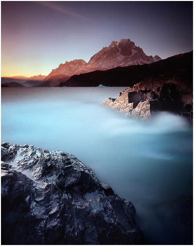
I've only just dipped my toes into my images from this years Patagonia photo trip. Here is a backlit shot of Lago Grey with Paine Grande cast in an orange glow from a setting sun.

I was initially attracted to the rock in the mid-ground - with it's graphic-angular shape and directional lighting. But it was only while setting the camera up on my tripod that I noticed the lower darker rocks. I felt these could be a great foreground detail with their mottled texture. Often black rocks turn to a muddy mess in a scene, but when there is back lit directional light shining on them, it can help lift their tonal values from extreme black, into the lower mid-grey tones. Making it easier for me to record them on Fuji Velvia.

I made this image on my Mamiya 7 camera. I'm aware that  I'm a landscape photographer who feels more at home with portrait-orientated compositions. Perhaps it's the ability to mix a lot of sky in with a lot of foreground that works for my eye. I'm really not sure, but having a mix of aspect ratios to work with has really helped me open up my eyes to the surrounding landscape and consider where each object should be placed.

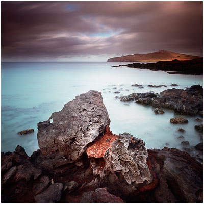
Pockets of colour on Easter Island

I found a bay on Easter Island where the sun wasn't bleaching out the entire landscape.

I used a very long exposure for this shot. Maybe around 2 minutes. Near the end of my trip, I stumbled upon some more great geology. These rocks are volcanic, as is all of the entire landscape of Easter Island. But rarely did I find pockets of red in the stones. I feel the red of the rock has a nice releationship to the golden colours on Poike - one of the triangular points of Easter Island that you can see on the horizon.

Looking for the essence #7

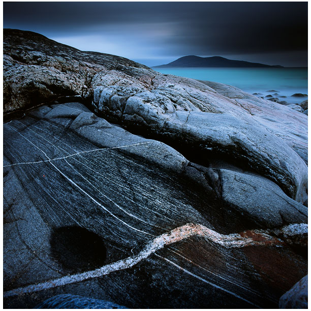
I knew something was there. The weather was closing in and the isle of Taransay on the horizon was often being misted in rain. The light was getting low and my exposures were going down into the 10 minute region (due to reciprocity).

When I encountered this scene on last May's Harris workshop, I spent about an hour or more just in this small location, looking for that elusive 'essence' I've been writing about over the past few weeks. The funny thing is, when I do feel I've reached 'it', and made some shots of it - the scene is often etched into my mind (I shoot film 100% of the time - I'm not a digital shooter, so I have to work with the scene in my mind a bit more than I would if I had a preview screen). I think we need to trust the gut instinct about these things. When you hit upon something that is working, it is as if your entire sensory input is being overloaded. I seem to find everything around me becomes more acute.

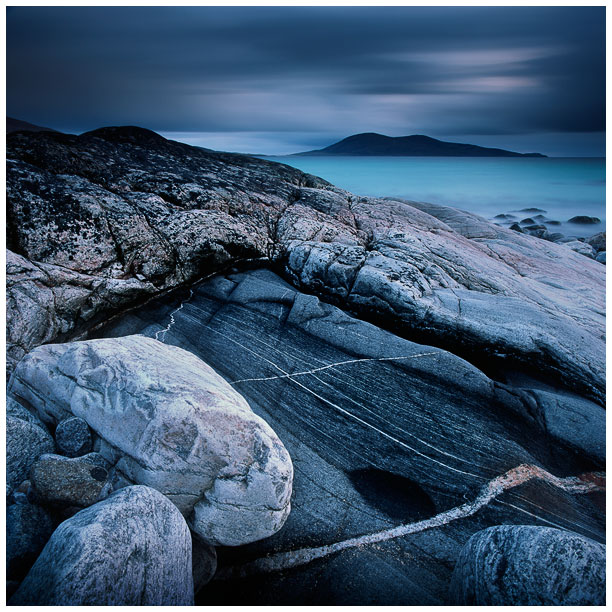
Here's an image that was shot in the same area just a few minutes apart.

I should tell you that I found the stones in the bottom left hand corner too distracting and as much as I tried to compose with them in, they never really felt as if they should be part of the composition. I'm often not really aware of what it is that's bothering me when I make images. I just tend to go with listening to how I'm feeling inside. I knew however, that it was the white streak of seam going through the foreground rocks that was pulling me in, and I felt very much that this was the 'essence' of the scene I was trying to capture.

Often we're not close enough.

When I moved to the right to try and extract the white rocks, I found that the dark eye patch seen in the bottom left of the first image became more of a 'motif'. It filled in the bottom left hand side of the frame beautifully. I find that with a bit of fine tuning, moving in closer, moving around just by a foot or two, things can 'snap-into-focus'.

Folded & Gathered

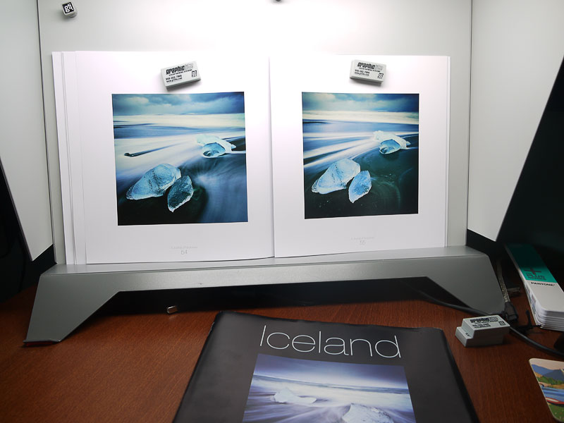
Last week, while I was on the isle of Arran, conducting a photographic workshop, I received the 'folded & gathered' sheets for my Iceland book that will be out in November.

In the above picture you can see two of the actual pages from the book, alongside the dust jacket below.

One of the things you have to get familiar with, if you're getting a book printed, is the terminology that a printer uses. So what does 'folded & gathered' mean?

When the printer prints all the pages of the book, they are gathered and presented in the final order. If you look at a book, the pages are often folded into sub books - my book arrived in a set of five sub-books, where each sub-book contains x number of folded sheets of paper making up the pages.

What is also interesting about this stage is that these pages are the actual 'real' pages of the final book. These are not proofs in that sense, but they still allow me to go back and say I'm not happy with a particular section of the book and ask for some reprints if need be (this is also costly and ads to any possible delays in the book).

It's worth noting that when evaluating the final pages of the book, do it under some daylight balanced light. I used my viewing booth to do that - it gives me great confidence and a 'level playing field' in which to assess whether the reproductions in the book will work in most lighting conditions (yes, any print can vary in how it looks depending on the type of light you view it under).

The whole process of putting a book together is quite an affair. And getting round the terminology that the printing world uses is an interesting experience too.

Glasgow School of Art

I love architecture. Most probably because of the lines and curves, tones and shapes that an architect has to think about when they design beautiful buildings. In my teens, I thought that this was where I would be headed with my interests, but my grades at school were never that good to get me there.

But I love going for a tour of a really beautiful building. Here in Scotland, we're a bit spoiled, because Glasgow is the home of Charles Rennie Mackintosh. He is to Glasgow (and Scotland as a whole), what Gaudi is to Barcelona and Catalonia. He was a genius who built some very beautiful buildings and furniture.

Tomorrow is my day off, and I felt that if I should go somewhere, and do something that gives me inspiration, and a deep sense of satisfaction - I should go and see Charles Rennie Mackintosh's 'school of art'.

The school of art was designed first and foremost as a 'functional' place for art students.

I never went to art-school - which was a surprise for me,  because I'd always been a bit of an 'art' kid all through my childhood and teenage years and always assumed this is where I'd end up after high school. I still wonder why I never made it to art school, but I'm willing to accept that maybe  I wouldn't be where I am today if I had.

But if I had made it to art-school, I would have preferred to go somewhere where the aesthetic married my own sensibilities and tastes.

Mackintosh's School of art would have been perfect for me. It is a very beautiful building, full of thought and design aesthetics, while also being a place of work - it is filled with contemporary art students.

I love it dearly, and I've visited it several times now.

I think architecture and photography are highly related - both require an awareness of space - as well as of the aesthetic. Both, when done well, can enrich our lives and give us a sense of belonging or 'emotional attachment'.

When was the last time you wandered around a beautiful building, and considered it's symmetry and tonal interest in the same way that you may with the landscape?

As photographers, we are creative people. We get our inspiration from everything around us.

It doesn't have to be visual, but certainly I find beautiful buildings as deeply pleasing (and rewarding) to be around as beautiful landscapes.

I understand the importance of being outside in nature, but I often feel that well designed buildings are our interpretation of nature - they are structured into a tidy, organised way - a way in which we make sense of the randomness of the natural world.

In that sense, beautiful buildings are very much like beautiful landscape photographs. They capture the essence of structure, form and tone of our surroundings.
Sample Slipcase

Last week I received a copy of the prototype slipcase for my book, and also the cloth bound outer casing of the actual Book. The printer hasn't put the inset photo into the slipcase, but you can see the actual book (minus dust jacket) in the front and the slip-case in the background of this photo.

I love the font that Darren chose for the book, and I'm now very excited about the the book's arrival. I should receive four sample copies early september. There will be a special announcement around that time via my newsletter mailing list.

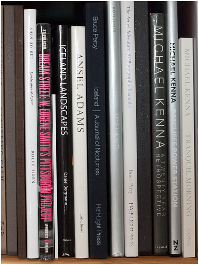
Here's another picture of part of my book collection. Can you spot the new slipcase within these books?

Looking for the essence (part 6)

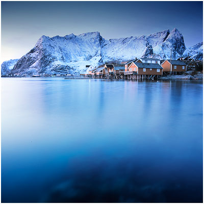
This will be my last post for the next few days, as I'll be on the Isle of Arran tomorrow for a week, conducting a photographic workshop. In the meantime, I thought I'd leave you all with this image that I shot in Lofoten islands, Norway - this March.

I love to shoot during the cusp between night and day, as I often find the light to give the landscape an otherworldly look and feel. It is as these times when the light is so special that I lose myself in my imagination. I think that's what we all strive to do with our landscape photography ultimately.... it's that passion for being outside, experiencing the elements that we are chasing. I also have to say that I find I feel very 'alive' at these moments. So I think that's why I love shooting in twilight and just at the cusp of sunrise.

In this respect, this is what I'm seeking in my images: to depart from the norm, to show a scene that conjures up a mood or a feeling that we have. To create something new and emotional. I'm not really interested in whether it is 'accurate'. It just has to have some form of 'essence' for me. In this case, I think this image takes me into a dream-like world, and for that reason alone, it does have an 'essence'.

Looking for the essence (part 5)

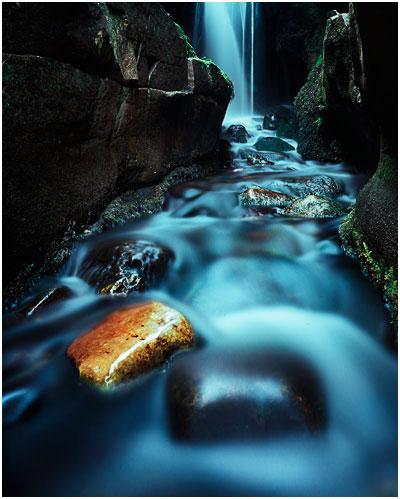
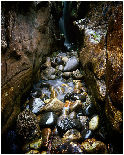
There's this fabulous little canyon on the Isle of Eigg with a waterfall at the back. I take my students on my Eigg workshop to this location, even though it fits only one person at a time because as much as the location is extremely limited (you can't really move much), you'd think there's only really one shot to be made in here. But last September, I 'captured' Iain on my workshop in here. I'd been trying to catch up with Iain, but felt he was a little too shy to spend time with me. So I managed to corner him in this little canyon and we spent maybe 20 minutes working on a shot similar to this one (my shot was taken after Iain had finished making his).

I loved my little 20 minutes with Iain here, because it was one of those moments where there's really something to impart. A very clear message can be reached.

We started off by making very general images of the canyon but I'd noticed that further inside there was this beautiful sandy coloured warm looking rock. It seemed to be shouting out to me - 'I'm here - take a picture of me!'. The reason why it stood out so much was that it's colour was very much outside the palette of every other rock there. I felt it would make a very strong compositional element - it would be the focal point of the shot if we used it correctly.

I know that Iain got a lot out of this little bit of time together as he thanked me and said it had been really useful. I was just so delighted that on all my times in this little canyon, a golden rock had surfaced and was so much there on it's own, it was a great feature (or device) to use in a composition.

I think Iain had said to me that he hadn't noticed it when we'd gone into the canyon, but it was, for me, perhaps the one thing that jumped out. I think there are two lessons here - exploring a location, even one as tiny as this can help you find things you never saw upon first encounter, and your final images may be stronger as a result. The second lesson is perhaps to realise that repeating the same location on different trips may yield new insights, new finds. I've certainly never seen that stand-out rock before.

I think I've taught myself over the years to think about 'separation'. Looking for objects in a scene that have a presence, either because of the light that is being cast upon them, or more unusually, because their colour makes them stand out a bit more.

I'm looking forward to going back to Eigg this September.

Storm over the isle of Rum

Back to that 'essence' topic again. As I work through the bunch of transparencies lying around, i'm aware that I just seem to be interested in those which impart a sense of mood and that have an 'elemental' aspect to them.

I do a couple of workshops on the Isle of Eigg each year, because I feel it's a great place to study the same landscape time and time again.

What I've noticed over the last three years of visiting Eigg, is how the light changes so rapidly there. Mood and drama come and go so quickly. It's very hard to impart that with a wide angle lens sometimes. The isle of Rum is a big presence on the landscape and often the mood and changing light happens in and around the Cuillin ridges of this mountainous island. I've just never really managed to capture it because it's so easy to go wide angle all the time.

Well this shot was a deliberate effort on my part to look beyond the immediate beach, and take advantage of the rain in the distance.

Rain is a beautiful thing. It's atmospheric properties can't be overstated I feel. Rain can be used to veil subjects - to conceal them, turning them into opaque tones of mystery.

They have a saying on the isle of Eigg.

"If you can't see Rum, it's because it's raining, and if you can, it's because it's not raining - yet'.

That's one of the many reasons why I love Scotland's landscape. It's moody, it's changeable, it makes for surprising gifts in the way of fleeting light. It's also a challenge at times, and when things do conspire to provide a beautiful moment, the moment is more enjoyable because you know, deep down, that it's rare and something to be absorbed and enjoyed greatly.

Looking for the essence (part 3)

A few days ago I titled a blog entry 'finding the essence'. I felt the title was apt at the time because my posting was about objectivity. When reviewing your own images after a shoot, being able to see the essence or beauty that is there, rather than being blinded by a desire to see what we wished the image to be.

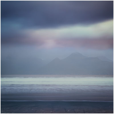
Well, I've been thinking about the word 'essence' and also the particular image of Harris I showed on the blog in that particular posting.

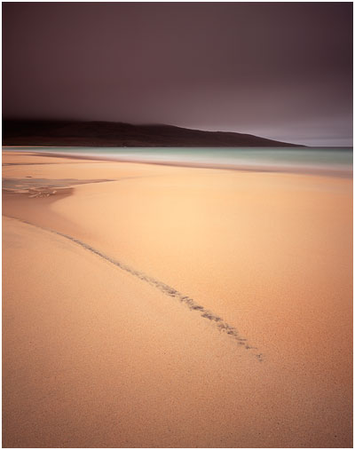
I responded to that image of Harris (reproduced here - image #1), because there's a lot of harmony going on in it for me. The tones really resonated with me and I also felt the composition was very simple too. When these two elements are married together, often the resulting image seems to be a more powerful statement. I think this image works so well for me because the 'essence' of the landscape has been conveyed very clearly - the message is strong.

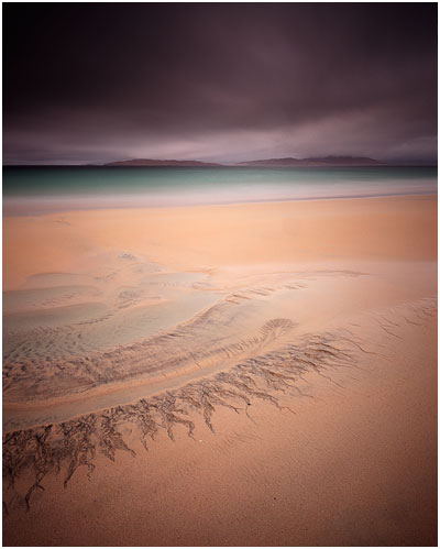
Compare image #2 that you see further on in this post. It's got similar light, and was shot on the same evening. Except I think this image does not work so well. It's missing that extra 'something'. I think it's failed to reveal the 'essence' of the landscape.

I often feel that simplification is a complex thing to pull off. What looks simple is often harder than it appears. Landscape images for me, must contain a soul, they must resonate with you on an emotional level, and breaking things down to colour, tone and form is the best way forward to make images that do that.

Image #2 is too clever. There's too much going on in it, even though there's not that much at all in the shot. But things are competing with each other. There's perhaps too much texture in that sky to sit in the background and let the eye fall on the patterns in the sand in the foreground. It feels as if I've put the wrong sky in with the wrong foreground. Both are not working in harmony.

Image #1 on the other hand is a different case. That sky sets a mood, but there's almost no texture in it. That lack of texture complements the lack of texture in the sand in the foreground. It is as if the sky and ground are working together - a form of visual empathy. And then we have that diagonal streak in the sand. It's allowed to be the focal point of the image and everything else around it is there to support it - not take away from it.

As much as I've tried to explain the images, and get you to think about why one works better than the other, I don't think there's such a thing as a rule book, and I have to confess that although image #1 is my favourite - it was a complete surprise to see it in my processed transparencies. In other words - I did not plan it. And i don't think I could have.

That's what I love about photography. It's those surprise elements. You only know what it was that you were looking for, once you've found it. That was certainly the case with this image.